Concept · Web design · Illustration
A website for an online memory game, written for the parents.
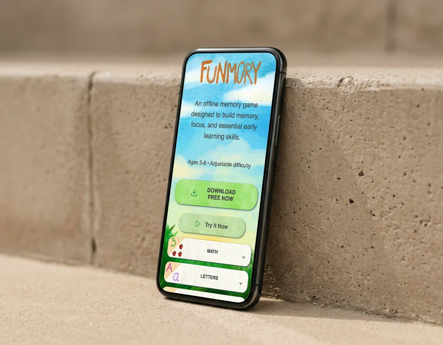
Two things at once: come up with an idea for a classic memory game that would work online, and build the website that sells it to parents. The website was the thing we delivered, the game was the idea we were pitching, and the audience was never the child.
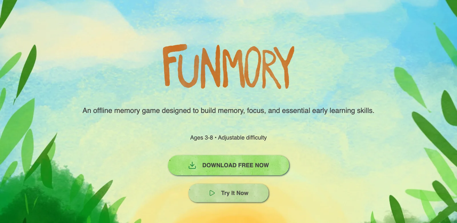
This sits near the top of the page on purpose. A parent is not wondering whether the game is fun, they are wondering what their child gets out of it, so that is the first thing we answer. Memory still works the way it always has, turn the cards and find the pairs, but every pair now belongs to a topic: animals, letters, numbers, shapes, countries. The child plays, and the parent gets the answer they came for.
The style is meant to read like an illustration book. Everything is hand-drawn in watercolour and set on paper texture, so it comes across as a warm, natural product rather than a digital one, which is exactly what appeals to parents.
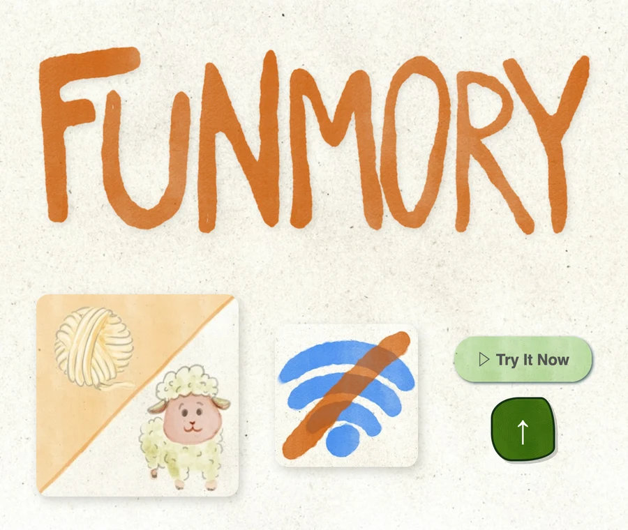
Three icons doing the work of three paragraphs. For this audience the selling point is not what the app does, it is what it will never do: no connection needed, no adverts, nothing to buy once a child is already inside it.